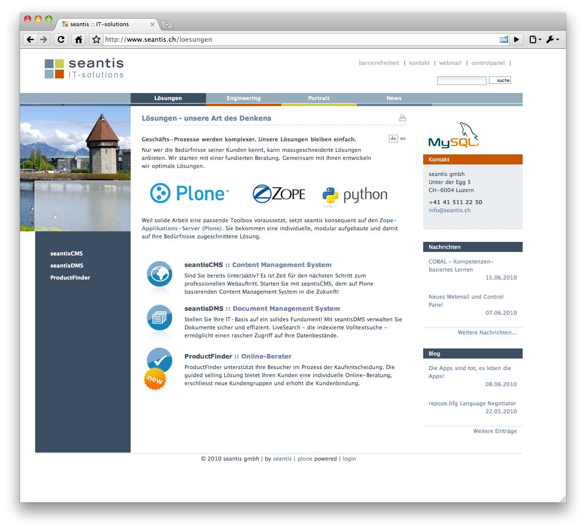
Four squares in four different colors. Life was good and business grew steadily.

Today (23 August 2012) Microsoft unveiled their new look and their new logo.

[http://blogs.technet.com/b/microsoft_blog/archive/2012/08/23/microsoft- unveils-a-new-look.aspx]
We could live with the four squares but why do they need to use the same colors (just a bit more shiny). From now on, everyone will think that we have stolen from Microsoft: but I swear it is the other way around!
- July 2011: http://web.archive.org/web/20110707002800/http://www.seantis.ch/
- Re-Design September 2010: http://www.seantis.ch/news/seantis-ch-auf-plone-4-0
Have a look at our website back in 2010.

